The brilliant primary hues, the glossy monochromatic schemes, to the elegant pastels and neutral colours; the combination of loud, vibrant and even kitschy colours seamlessly and glamorously capture the colourful beauty of Art Deco posters Australia and their design. The popular design style of the 1920’s and 30’s covered virtually anything that could be touched by design from building exteriors and interiors, cars and pop culture, fashion, to graphic design and illustration. The design style dominated this time and today continues to influence designers and artists.
I first noticed the striking beauty of the Art Deco colour palette when I was given a book by my sister-in-law on one of the masters, ‘Father of Art Deco’ Erté, a graphic artist and illustrator of the Art Deco era! Born Romain de Tirtoff, Erté the Russian-born French artist and designer (1892-1990) was a pivotal figure of Art Deco aesthetics through his designs of prints, sculptures, art objects, jewellery, fashion illustrations, stage and film sets and much more.
Erté’s inspiration of colour and design was drawn from his early study of Indian and Persian artfully sculptured painted miniatures. The Persian love of richness of colour and pattern can be seen in his works. Two of my favourite Erté illustrations are ‘Rainbow In Blossom’ and ‘Optimism And Pessimism.’ There is a simplicity in his use of primary hues of reds, yellows and blues, vibrant, yet uniquely subtle to the eye. Erté’s use of vibrant rich colours, elegant line work defining detail and flat colour infill along with his romanticism and wit shines through in these artworks.
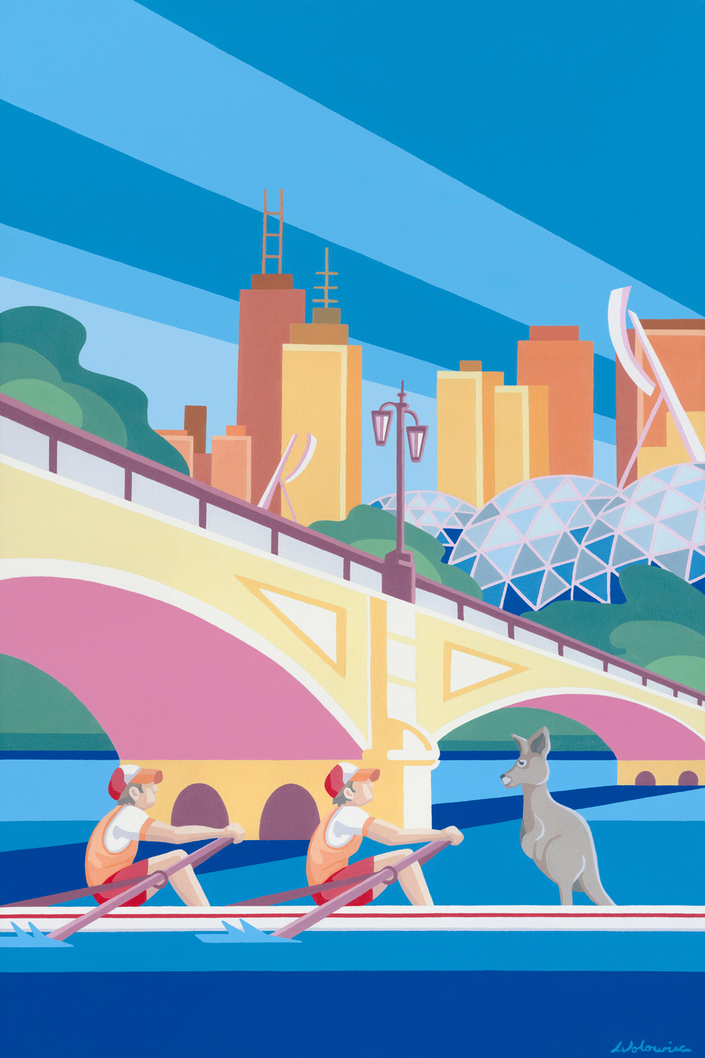
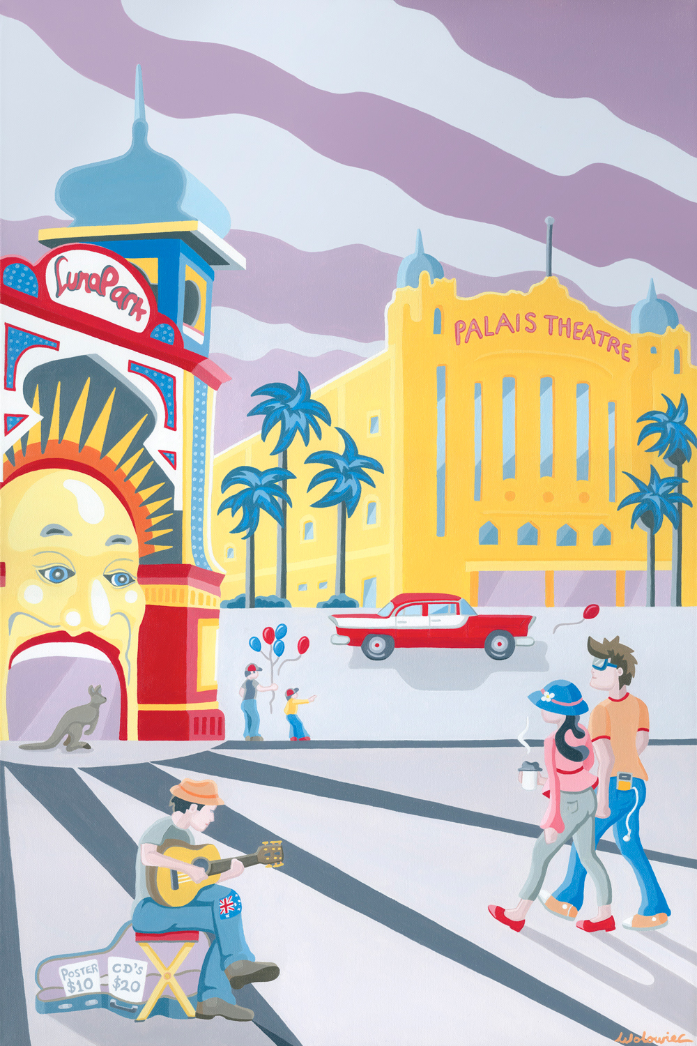
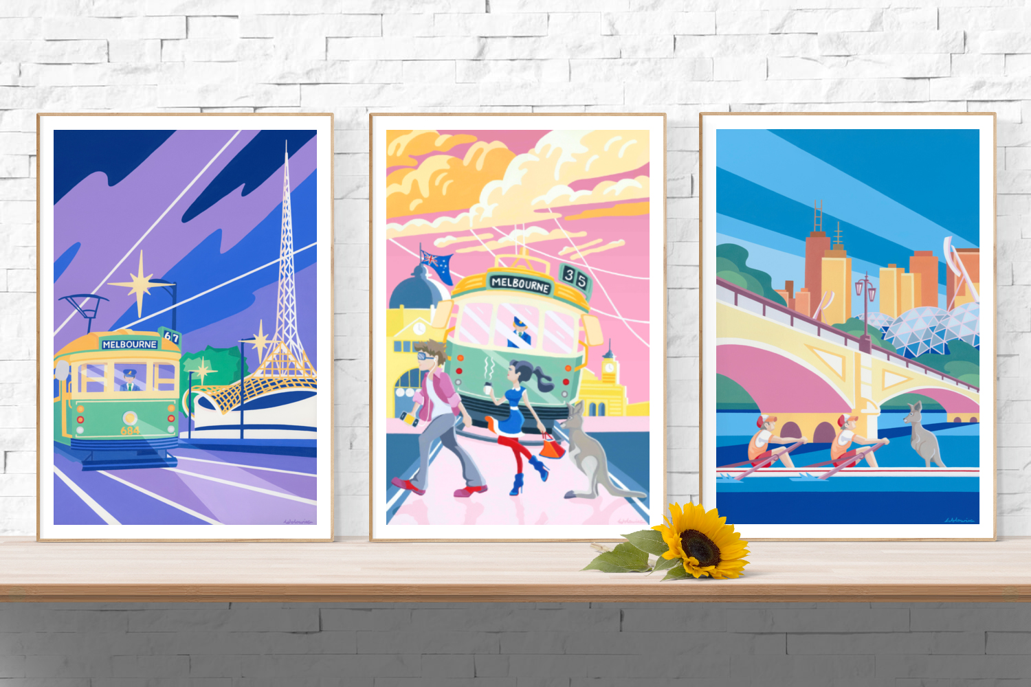
Popular colours of the art deco era included bright and deep yellows, reds, greens, blues and pinks – and are included in my Art Deco prints. My latest painting series the ‘Melbourne Poster Series‘ was inspired by the Art Deco period and this popular colour palette. I think the most exciting part of creating art is creating a palette of colours that visually complements the theme and style in which you work. With that in mind, I brought colourful vibrancy to the playful style painted, and combined that vibrancy with the elegant pastels of the art deco era. Colours have the ability to influence human emotions. Whether it be bold and bright, metallics, neutrals or black and white, the Art Deco colour palette was a key element in the success of designing art of all forms. It was essential in capturing the essence of an era that represented modernism, romanticism, wealth and elegance. It has certainly influenced the work in my Art Deco posters Australia.
Erté always insisted on solitude when he was creating in his studio, no one could watch him at work, except his cat! In the background, classical music would be playing, perhaps Bach or Mozart. He would work late in the night where he had no interruptions and unlimited time. One bright lamp helped him see the true colours of his work. If I had the chance to share his solitude alongside his cat for just one day, and get inside his masterful creative mind, I would have loved to have seen how he saw his world in colour. Did he intuitively know what colours worked seamlessly with his designs to create that perfect balance between boldness and elegance? I would like to think his intuition played a big part in his design success and bestowed as the ‘Father Of Art Deco‘.